Behind the Scenes at the River Lane Architecture Project
We love to share our design projects with you, and often you just see the finished product. This time we want to let you peek behind the curtain of one of our recent projects, the River Lane architecture project.
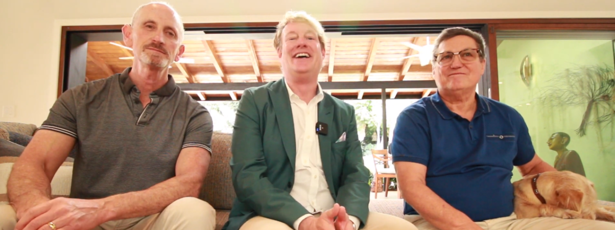
The homeowner, Ron, has been a dear friend for many years, so this project holds a special significance to us. Of course, you know that we lean heavily into indoor/outdoor design, and our architectural and interior design had amazing outdoor space to work with, designed by Scott Zucker of Zucker Design Associates. We all recently got together to discuss the project.
Outdoor Landscape Design
Actually, the beautiful landscape Scott had already installed was really the impetus for the entire design. We ended up opening up the whole house and added a brand-new sliding door system onto an existing loggia that the client used a lot. I know because I’d had many a beautiful dinner or lunch out there. And part of what we did was try to unite the two rooms more than they were before.
We asked Scott about his inspiration for the design and he said, “We wanted to do something that was more tropical in nature from what was here. Knowing Ron as well as I did and do, I knew that he wanted to kind of stand out in his neighborhood. To be something that was a little bit different than what everybody else did. So I started thinking outside the box a little bit about what we could do for the front And it turned out better than I actually anticipated.”
Ron added, “We wanted to do something that would highlight the art and the art would become the centerpiece and build around it. I wanted a woodsy feeling. where I was out in the woods and I didn’t want a lawn.”
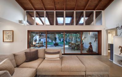
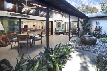
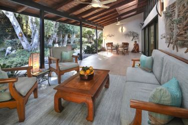
You can see looking out from the loggia that the yard is full of mature trees and shrubs, very private. The courtyard has various plant beds, surrounded by concrete walkways around a center filled with round stones. In the center is a spherical stone fountain. The whole effect is peaceful, cool and woodsy. You get the feeling, even from the kitchen looking out into the loggia and courtyard, that you could indeed be in the middle of a forest.
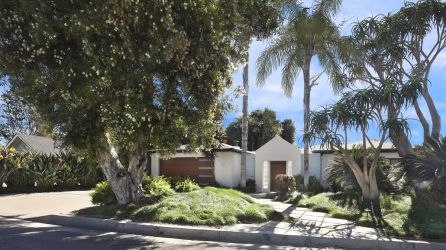
The front yard also has a lot of mature trees and grassy areas. It’s just a beautiful design.
Scott added, “I don’t often get a chance to come back to client’s house, especially 20 years after it was installed and see how it’s grown in and changed so. And then we’ve worked together on additions and changes through the years it’s been a work of love.”
Kitchen
As mentioned we have been friends with Ron for many years, so I had the pleasure of being at the house many times and had many wonderful meals cooked by Ron. He is an amazing chef and I must admit when he asked me what I would do to remodel his house I had no idea. Because what happens is, like most architects we end up putting blinders on. We just can’t sit and notice everything. Once I did have a chance to do a deep dive and really land on a solid direction, I knew we had to create a kitchen Ron could work in.
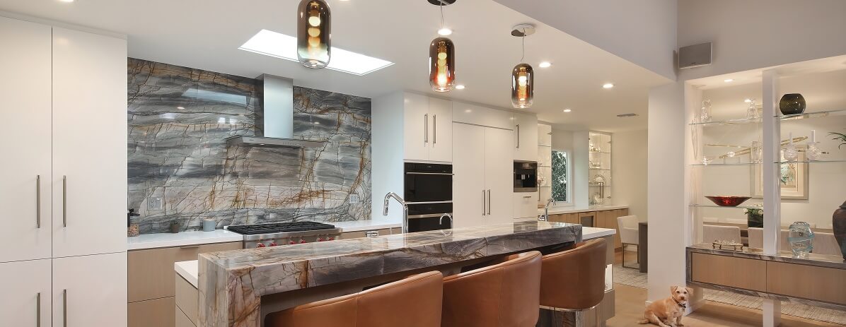
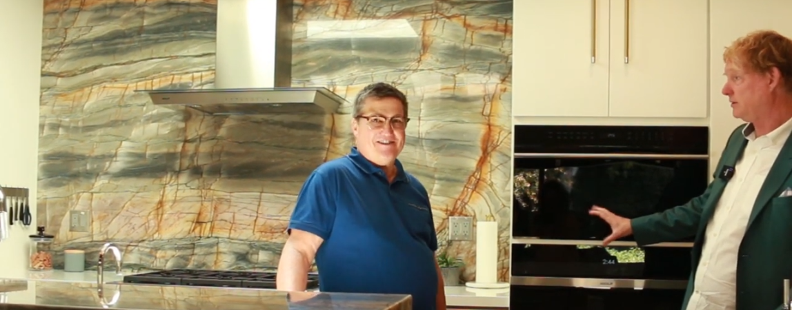
Some of the biggest changes we made was of course opening it up. The previous kitchen did have an opening but it was much smaller. The beautiful stone, which is called Picasso, which I loved considering Ron’s art collection, is the fact that it helped us create a center that relates all the way to the new sliding door, the loggia, and the fountain beyond. And that became the basis for the organizational principles.
I was curious about the real life feel so I asked Ron what is it like to cook there?
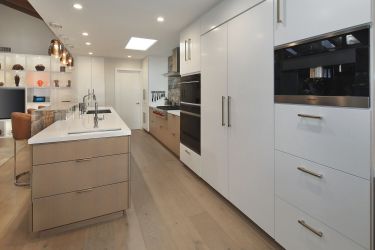
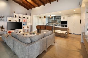
“This kitchen?” he asked. “Unbelievable. Everything rotates around a professional kitchen. I can stand here in this extremely large sink, which is 36 inches across! Big sink. It’s very deep and we have two dishwashers but I can turn and grab utensils easily, there is instant hot water if I need it to mix anything with some hot water. The kitchen has a lot of counter space that is easy to clean and which was important. There’s counter space everywhere. There’s a big gas stove and the oven is by Wolf and is very rapid-works perfectly.”
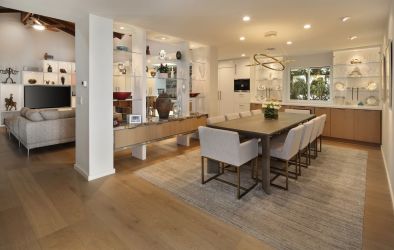
This level of appliance, a professional Wolf range, was new to Ron. His kitchen previously had appliances from the 80s, complete with a twist timer! In addition to the range, Ron went all out and chose a built-in refrigerator and freezer system and built-in coffee maker. We also extended the cabinetry right into the now open dining room. The old dining room was my least favorite room of the old house because I love light and airy spaces, and this room was dark and small with only room for 4 people. Considering Ron’s cooking we needed to fix all that so was so glad to hear the kitchen was working out for him. He added, “It’s fun-like working in a professional kitchen like I used to 50 years ago.”
It is a neat experience working with friends. Even after knowing him for decades, I learned that Ron actually went to culinary school for a year to study French cooking!
Primary Bedroom
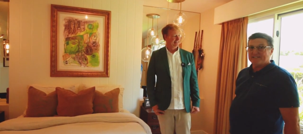
Art is a big part of Ron’s life and he has a big art collection. When we started the process, we learned that he actually had 48 pieces of art hanging throughout the house. We had to think that out a bit and I asked Ron and Jason to select pieces for the bedroom that were meaningful to both of them.
They chose one that was done by Ron’s mother. He said, “This painting was done by my mother in 1987. It’s cubism and it’s the style of Picasso which my mother painted in. She was a highly prolific artist that sold hundreds of paintings. The colors in this painting are fantastic and all the different sizes and shapes of heads, and the symbolism throughout the painting is just fantastic to me. I see a lot of my childhood in it”
For such an important painting we recomposed the entire wall, and we used a lot of colors from the painting in the rest of the room. However, we let the green color that was one of Ron’s favorite things about the painting, stand alone. We just let it BE on itself.
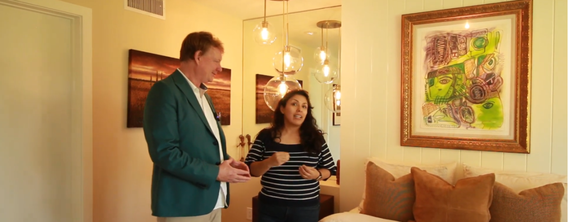
My interior designer Liceth handles a lot of the materials and material selections for us and she had a big part in this project.
Liceth told us, “I knew I needed something warm. I was going to look not just at the art but also at the frame because we wanted the bedding and everything to highlight the art. We didn’t want to pull too much attention from it. We wanted the art to just shine and that’s why we picked all the colors that we did.”
In fact, I thought she nailed it from a textural standpoint which I love. There’s not a lot of color going on in the room, and you can see the direct relationship of the colors and the painting. I think the way she brought these different textures into play is amazing.
You might think that the uniqueness and thought that went into the River Lane architecture project was because we were doing it for our friend. But we treat every project as an opportunity to create an exceptional space and experience that is unique to the client and the site. If you are looking to remodel or build and you want something exceptional and “you” contact us for a consultation-we would love to talk to you.
Contact Dean Larkin for Exceptional Contemporary Design in California
Dean Larkin Design was established in Los Angeles in 1999 and this architectural design company maximizes the intrinsic potential of a location, including its available natural light sources. Dean Larkin is very familiar with both historical and contemporary architecture design in the entire Los Angeles area, and the firm endeavors to achieve a complexity that is multi-layered with an effortless elegance.
For a design that is modern and innovative, unlocks your location’s innate potential by making specific use of light, views and more, and uniquely designed for the way you live, contact Dean Larkin for a consultation.