Farmer’s Daughter Hotel Project
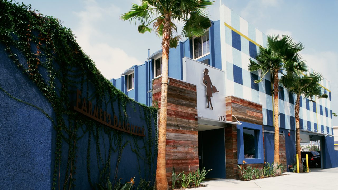
Nearly 20 years have passed since Dean Larkin remodeled the historic Hollywood Hotel called Farmer’s Daughter but Dean remembers the project fondly. “It was a really fun project. The owners liked the double entendre of the name Farmer’s Daughter. When we did the restaurant, the joke was that it was like ‘the farmer’s daughter came home to cook.’
We didn’t have any preconceived notions and the client really liked that we were thinking outside the box. We were able to look through the lens of the concept–What would a room look like if it was your grandma’s country room on acid?”
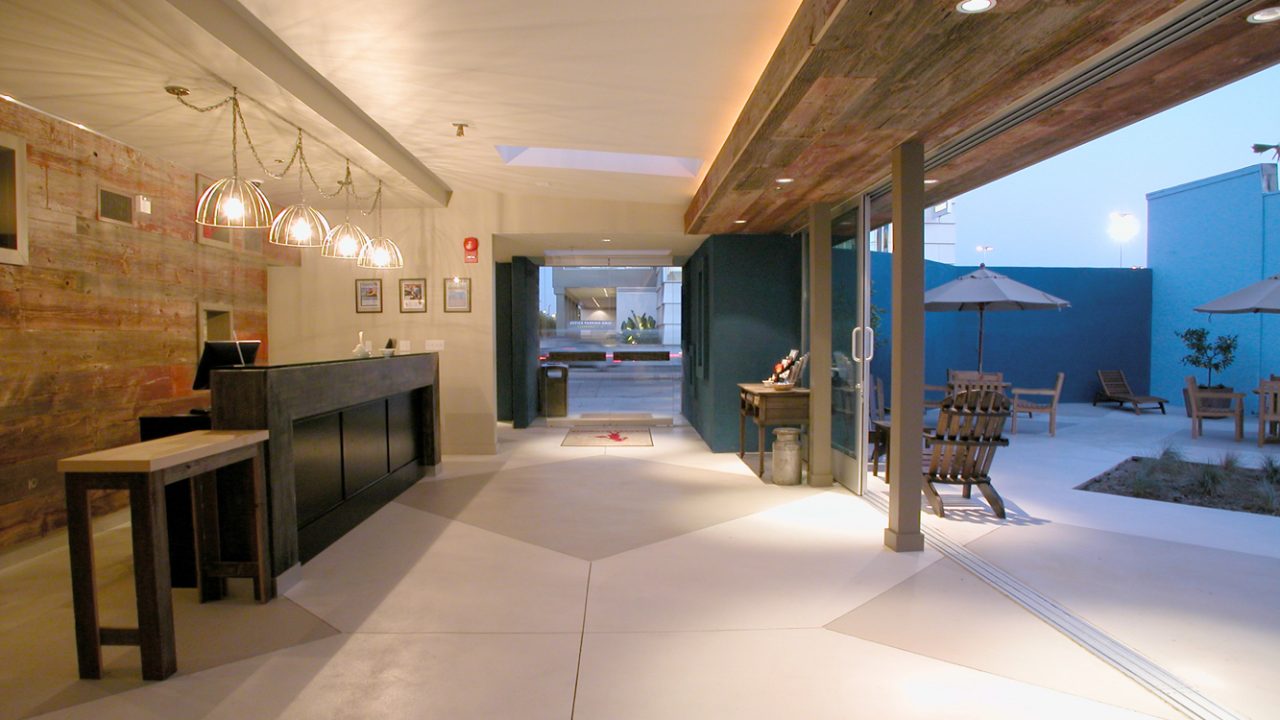
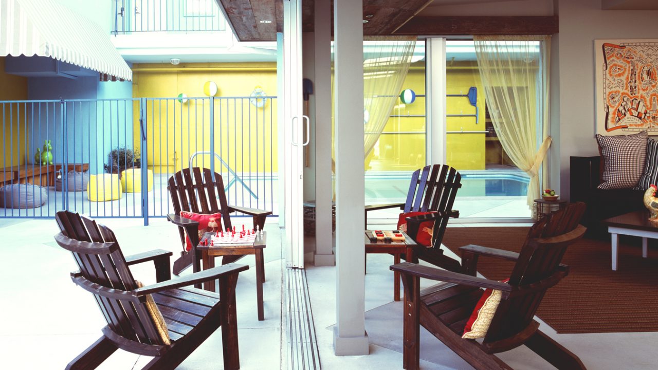
When Dean began the project, the building was actually a motel, with no lobby, where people could drive right up to their rooms. The motel, on S Fairfax Avenue, was right across from CBS Television City where The Price is Right was filmed. Hopeful contestants would stay at the motel to line up the next day for the show. The Farmer’s Daughter would put up pictures of winners, and Dean Larkin Design created a sort of niche to showcase those winners. They also created a courtyard/lobby so that people had a place to go besides their rooms.
The motel has its own place in the lore of LA. According to the owner in an article on lalist.com, the motel was kind of a no-tell motel dating back to the 60’s. Dean recalls that the actress, Julianne Moore, mentioned the motel at an awards ceremony. She recounted that when she was reading the script for Boogie Nights, because of the nature of the script and the fact that she had kids at home, “Yeah I had to take a room at the Farmers Daughter because I didn’t want to take the script home.” It was so known in Hollywood that you could just say that and people were like, “Yeah, the Farmers Daughter.”
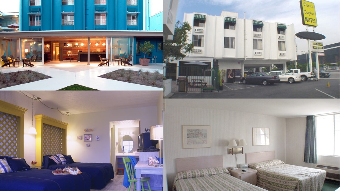
The Farmer’s Daughter Design Elements
The building was white when Dean Larkin began the remodel. He came up with taking the name off of the building and just letting the building be the sign. He felt the gingham paint scheme really landmarked the building so that no actual sign was needed. He notes, “We blew up the farmer’s daughter silhouette and the only place the name appears is at street level for pedestrians. This feature added to the panache of the hotel because it was like the best kept secret.”
Color Scheme
The new color scheme for the outside of the hotel had an interesting source. Dean “had one of the first signature turquoise 2002 T Birds. Everyone loved the color and so it became the inspiration.”
Flooring
Hotel and motel standards were very strictly defined 20 years ago, so the floors were pretty much all carpeted. But to fit the theme of an old country house, Dean wanted wood floors. “What we used looks like wood, but it was a wood-like vinyl. 20 years ago it was a big deal for us to not put carpet in rooms. I give our clients a lot of credit. Nobody was doing that If they were part of a chain they couldn’t have done it.”

Walls and Other Elements
Dean Larkin Design took the theme through the design of the entire hotel. “All the duvet covers were denim. Which was a great ode to what farmers wear. Painted chairs were mismatched like you’d see in your grandma’s home. We only wall-papered partially. Wall papering was common because it was more durable theoretically. So we wallpapered the bed walls and painted the others.”
For the art, a local artist, Jessie Azzarin, who was a friend to the owners came in and Dean remarks “she was so quirky. Pictures would be like a fried egg floating in the sky. They fit the scene very well and we had a lot of art created for that.”
Boutique hotels have loosened up the guidelines a lot since 2002. But the Farmer’s Daughter was a rarity when the redesign occurred in 2002.
Contact Dean Larkin for Exceptional Contemporary Design in California
Dean Larkin Design was established in Los Angeles in 1999. This modern architecture firm maximizes the intrinsic potential of a location while meeting each client’s specific lifestyle, business or institutional needs. Dean Larkin is very familiar with both historical and contemporary design in So Cal and the entire Los Angeles area, and the firm endeavors to achieve a complexity that is multi-layered with an effortless elegance. Dean Larkin enjoys collaboration, among his team, but also with his clients, and design element vendors. Dean feels that a team is more than the sum total of its individuals, and with a good team, each party contributing, he can see a 2+2=5 or more being the end result rather than 2+2=4. For a design that is modern and innovative, unlocks your location’s innate potential by making specific use of light, views and more, and uniquely designed for the way you live, contact Dean Larkin for a consultation.